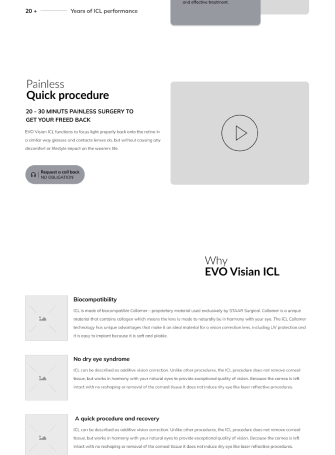
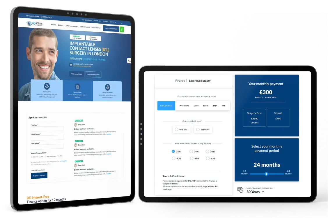
Eye clinic
web re-design

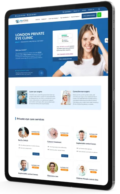
Eye-clinic Website

Re-designing exciting website to attract new patient and and get more requests booking

This project involved a comprehensive overhaul of a client's website, focusing on enhancing functionality, accessibility, and user experience while ensuring top-tier security for sensitive data. We streamlined the site from over 100 pages to 60 without compromising on essential features, employing a hybrid development approach with WordPress and Next.js to maintain flexibility and security. The project successfully met all technical SEO and user accessibility standards, demonstrating our commitment to delivering robust and scalable web solutions.

Challenge

In this project we had to address number of changes before staring the project. We knew that due to lack of technical expertise in client side and the size of the project we need to visualise the solution as much as possible for the client so they can understand it better.

Requirements gathering

Main challenge we had was to gather the project requirements was not technical and not sure what will work and how they need to approach it. specially they had some bad experience from the previous team. So, at the beginning they were doubting our decisions! We had to proof the concept top them first.

Reducing the number of page

Second but not last challenge we had was reduce the number of pages. We have asked to reduce the pages from 108 under 100 pages without losing the functionality and eliminating any important user flow.

Security, scalability, maintainability, accessibility

Client also wanted us to build the website in a way which they can easily scale it and have top security setup in place as they were recording patient information in their database. Another fact was that sue to nature of the business and the type of target audience they wanted the website to be accessible. The system should be also easy to maintain for a web master.

Approach

Our approach was methodical and user-centric, starting from the ground up to ensure clarity and ease of use for all stakeholders. We focused on visualising the end product through sketches and flow diagrams, simplifying technical details, and integrating strategic content solutions to enhance the site's structure and user experience. Each step was tailored to meet the specific needs of the project while adhering to the highest standards of web development and design.

Requirements gathering

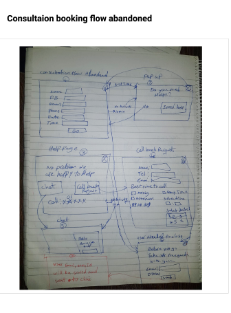
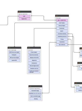
We started from scratch, which is the quickest and easiest way to visualise the website user flow and functionality. After sharing a few quick sketches, we had an idea of what the client wanted to achieve. We then started turning those sketches into user flow diagrams, which are much cleaner and easier to understand for the user. We avoided using any technical terms in our diagramming and used pure simple English and day-to-day language so a non-technical person could understand it easily.

Reducing the number of pages

For this part, we implemented a SILO content strategy where we combined similar pages and merged them where possible. We also merged user flows for similar goals on the website. We leveraged the power of infographics, videos, and illustrations to eliminate extra pages.

Security, Scalability, Maintainability

As the client wanted a solid baseline for the business to be able to adopt new technology and wanted a very secure system, the best option would have been to go for complete custom development. However, the client wanted to have a CMS in place so their webmaster could use it for day-to-day business operations and regular website updates. So, we decided to go hybrid and use WordPress as a CMS but in a headless format. We also decided to develop the frontend using Next.js and then use WordPress as a bare minimum for maximum security. With this setup, we could build a website where a non-technical user can manage day-to-day tasks and the system is secure, scalable, and maintainable.

Result

We managed to reduce the number of pages from 108 to 60.
We achieved a 100% technical SEO score and 95% accessibility and best web practice according to the Google report. We also fulfilled all the webmaster requirements by developing an edit option for the pages using custom fields and providing a comprehensive step-by-step user guide including screenshots and videos. The website we delivered is easy to scale as it has version control and a clean code base in place. It’s very secure as we are hosting the frontend totally separated from the backend. We also developed a staging area separated from the live site to ensure the live website is safe and secure and that deployment to live is only possible after operational approval.

Hire us

No obligation to hire FREE estimation

With just one click, you may simplify internal business procedures and establish the much-needed resource synergy.

Let`s discuss your project
;
Get a free quote
WhatsApp